perfect touch
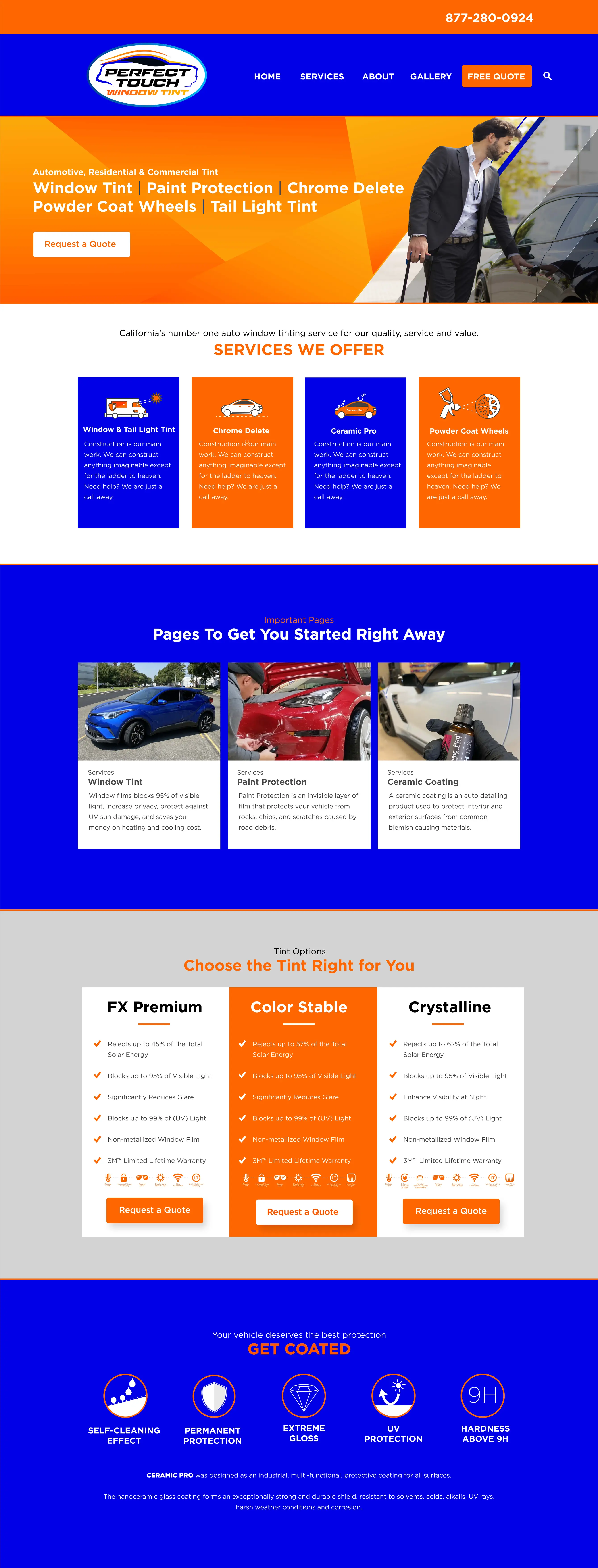
The 'Perfect Touch' website underwent a recent overhaul, transitioning from an outdated appearance to a modern, user-friendly experience. The update improved both aesthetics and functionality, enhancing navigation and user engagement.
Website's previous version featured sharp-colored images, predominantly illustrations or stock photos which didn't inspire trust due to their generic nature. Moreover, there was noticeable inconsistency between the logo and banner design, creating a disjointed visual identity for the site.
Old Version:

New Version:
I replaced the sharp-colored, generic images with high-quality, authentic photographs, creating a more trustworthy and professional impression. Also, I redesigned the user interface to reflect a modern aesthetic, enhancing usability and visual appeal. These updates not only revitalized their website's appearance but also contributed to a significant boost in their business presence and engagement.


